
Alexander Mostov is a picture book illustrator and freelance designer.
He built a name for himself last year illustrating four books with publishers Sasquatch Books and Wide Eyed Editions, with three forthcoming titles.
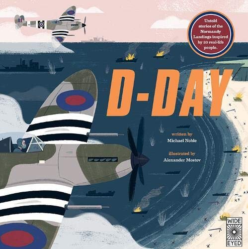
Mostov’s illustrations have made it to the pages of The New York Times and Yes! Magazine and his client portfolio includes Google and Facebook, among others.
Alongside his professional work, he explores multi-media work, most recently working on a series of block printed t-shirts.
His style is highlighted by colorful, high-contrast whimsy and technical efficiency, often depicting interiors, buildings and flora.
Given your extensive freelancing clientele, how is your time divided between projects?
Right now I’m 60% picture books, 10% editorial (magazines), 20% commercial work and 10% miscellaneous random projects. My ideal would be to trade some of the corporate stuff out for more picture books or selling original artwork.
You studied Architecture at Clemson, what caused you to change your track after college?
For my junior year I studied abroad in Barcelona where I worked on community-driven, aspirational projects with local architects. We were revamping city parks to be more functional and accessible to the neighborhoods and a lot of community input was used to to guide the project.
When I talked to American architects, the projects were less aspirational and more nuts-and-bolts. It was disenchanting.
Throughout college I drew little comics on the side. After graduating, my uncle suggested graphic design. I didn’t know “illustrator” was really a job at that point. I went through a couple of internships and found myself freelancing on the sides, illustrating posters and I loved it. I was doing anything I could get and eventually I built up illustration clients.

Do you see a large difference between fine art and illustration?
It’s weird, you could look at a lot of modernist painters and have a quite solid argument to say they’re illustrators, so it’s weird how we define them. It’s the context in which their shown: whether its commercial or on a white wall.
I haven’t been interested in pursuing the gallery world, I get more pleasure out of making stuff that accessible to people.
A board book you can buy for five dollars, most people can afford that. I’d rather have a friend of a friend text me about my picture book being their 6-year-old’s favorite.
A major difference between illustrations and fine art, I think, is if you’re an illustrator and you don’t change your style, you won’t be successful. Some people see it as selling out, but as an illustrator you have to reflect society, and if you’re not changing to do that you’re not doing a good job. It’s less of an insular expression than fine art can be.
Have you developed your own palette or theory of color in your work? Can you describe your style?
Angular, whimsical and playful with elements of mature humor. I’ve held onto an axonometric style from architecture — three dimensional compositions with forced perspective that doesn’t exist in reality.
I like the really stark contrast between solid black and white. White and black are the most powerful things to use in contrast to the colors, and beyond that I use "The Trader Joe’s” of primary colors, slightly off-brand blues, yellows and reds. I’ll often end up with orange red, greenish blue and mustard, unintentionally.
What sparked your interest in illustrating picture books in particular?
A lot of illustrators are gravitating toward picture books. People are pushing boundaries artistically, escaping realism.

People say it’s a second or third golden age of picture books - and for an illustrator it’s considered a real way to access creative control. The team you’re working with is usually small - an art director and the author. The good art directors will say “Here’s the text- interpret it.” Which is a lot of control.
It’s different when you’re working for companies. They have their own agenda, have done the market research and know know exactly what they want. You’re more like a hired gun than a creative person.
As you said earlier, the illustrator is tasked with reflecting society- that feels like a powerful space to occupy, and we’ve talked about issues of representation before, how do you think about this in terms of your work?
In a way I use it as my miniature soapbox - there is a serious lack of diversity in illustration. it’s not always the illustrator’s fault, it’s the fault of those with the money calling the shots.
I have the power to do something and represent larger perspectives. I’m really making a concerted effort to push the boundaries of diversity and not just representing skin color but religious backgrounds and abilities.
I’m working on a book about protecting the rainforest and want to represent indigenous cultures accurately so I’m not going to make these whimsical. I’m going to keep it as true as possible.
I was working on a piece about a Chilean native community and I had to push back against the publisher’s dated reference photos to not misrepresent how people actually live and make them into stereotypes.
There’s a fine line to how this works and you have to be vigilant to avoid unintentional bias.
Check out Alexander’s website here.